Design and print a book using a classic short story.


Design and print a book using a classic short story.
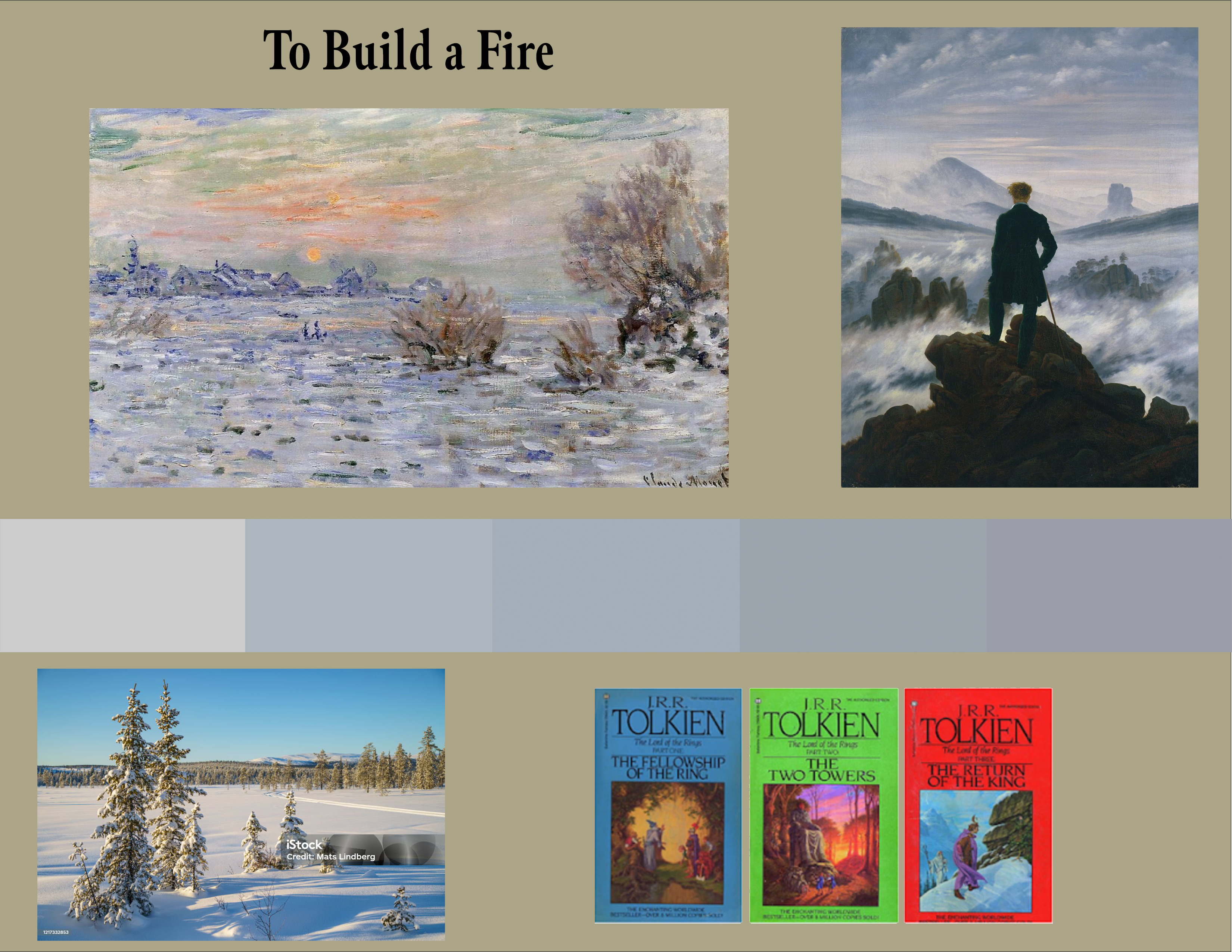
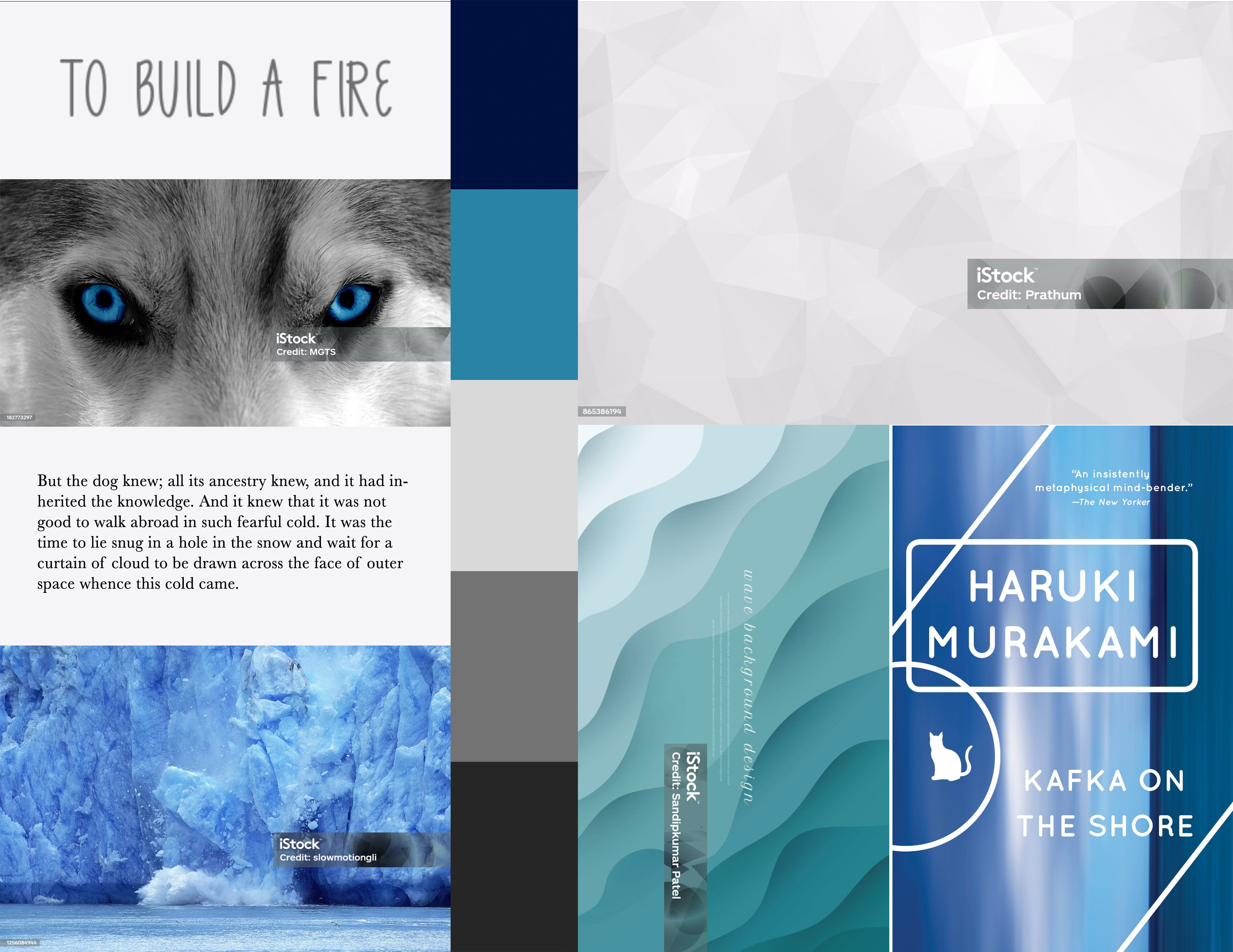
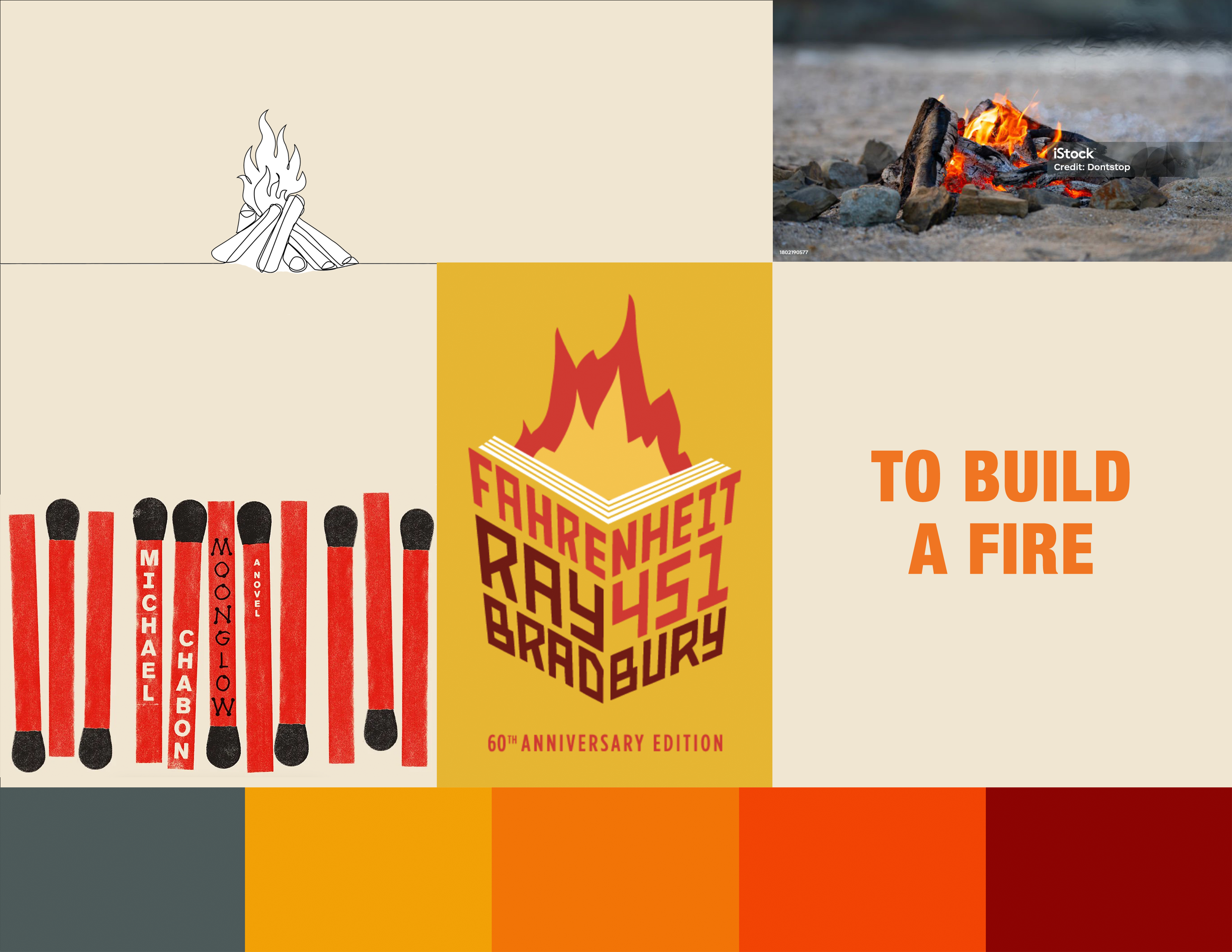
The mood boards each focus on a different environmental aspect of the story. The gray of the tundra, blue ice, and red flame.
Light blues and grays evoke the monochromatic landscape of the Alaskan tundra.
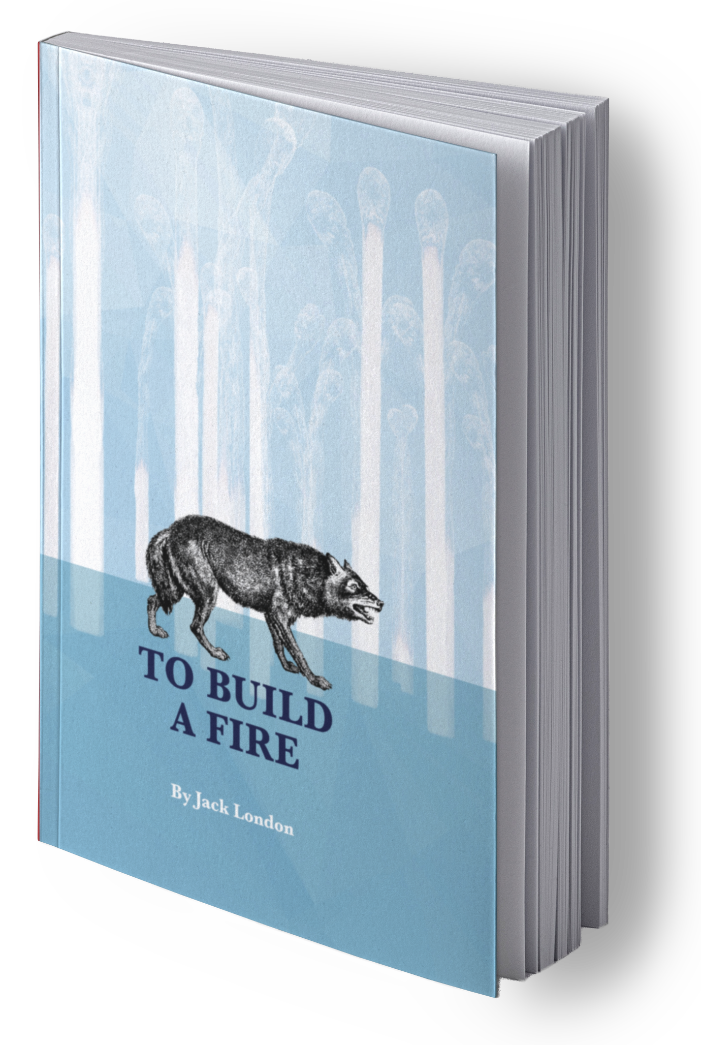
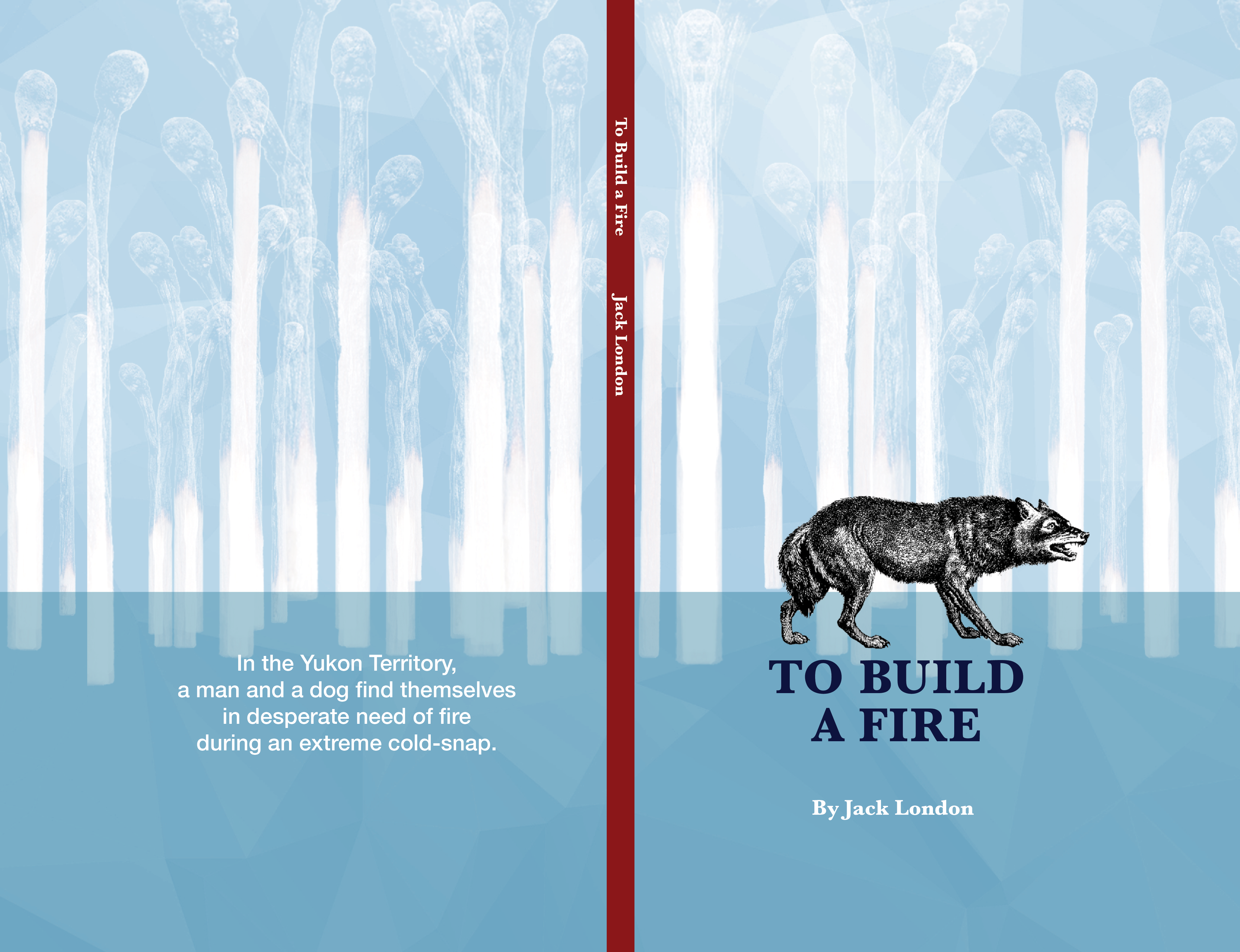
One typeface, Baskerville, is used for the cover and story copy. The serif typeface gives a classic feeling to the geometric background on the cover. Helvetica Neue is used for front matter pieces.
I wanted to focus on the parts of the story external to the narrator. The burnt matches as trees foreshadow the climax of the story.
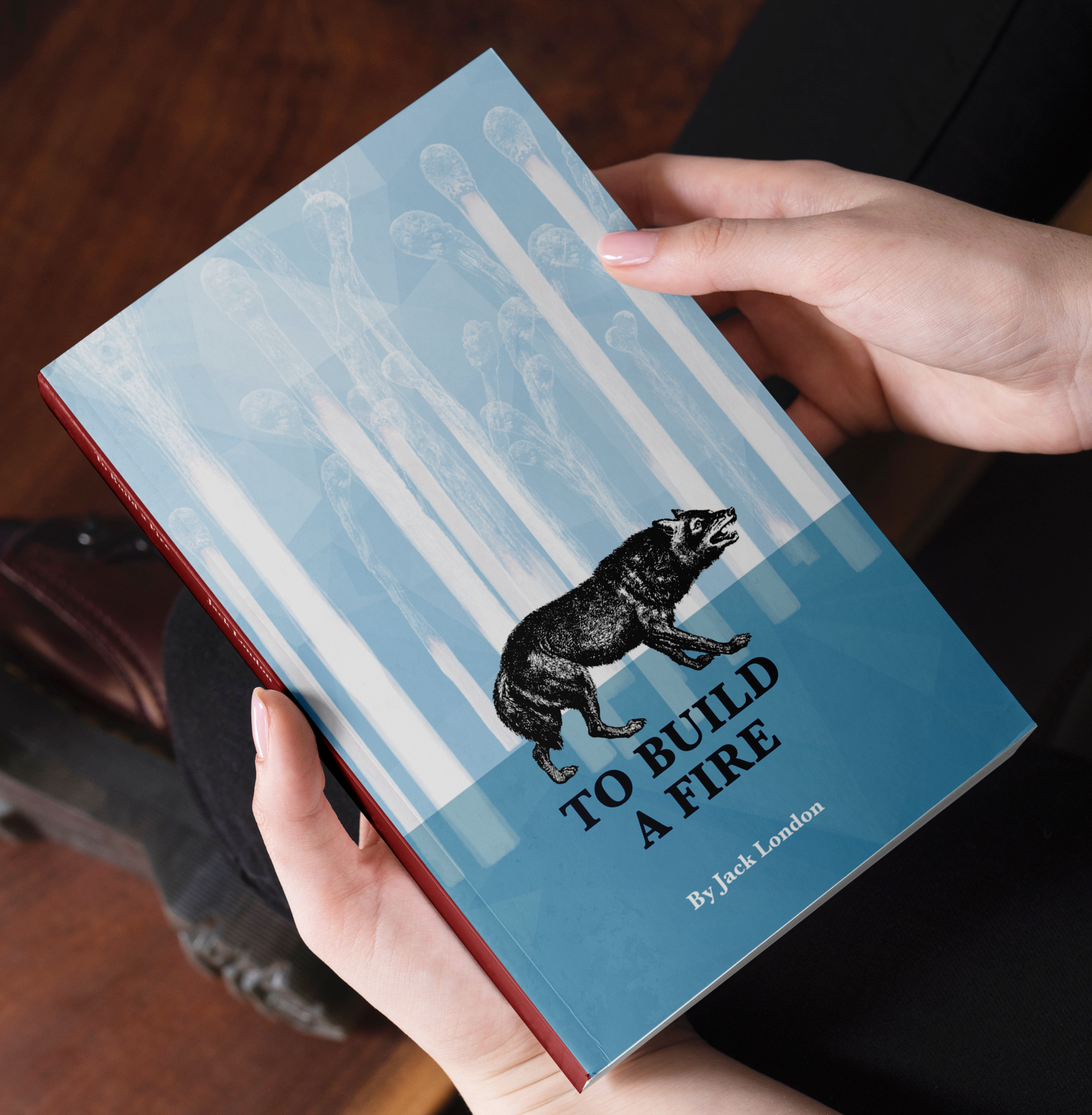
With such a short story the cover does consists of most of the design work. It shows readers enough of the story elements to get them interested while the layouts provide an enjoyable reading experience. View the final design.