Create the first issue of a magazine focused on trend pieces and pop culture.


Create the first issue of a magazine focused on trend pieces and pop-culture.
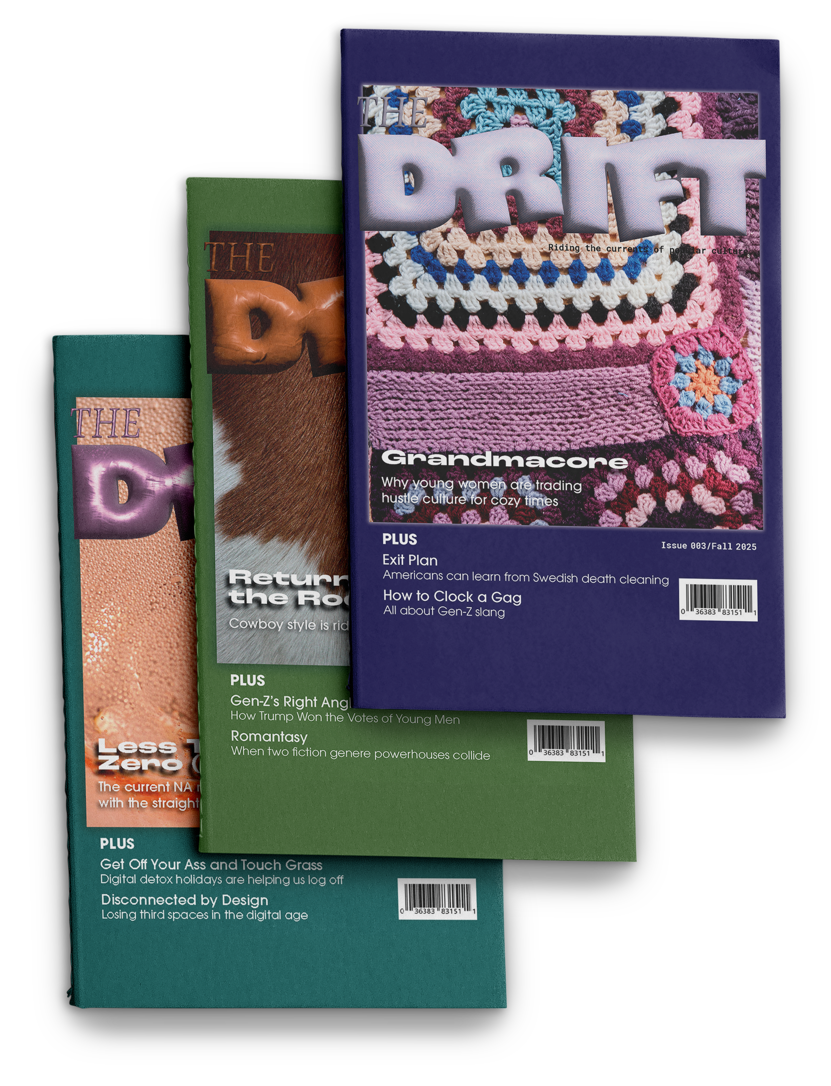
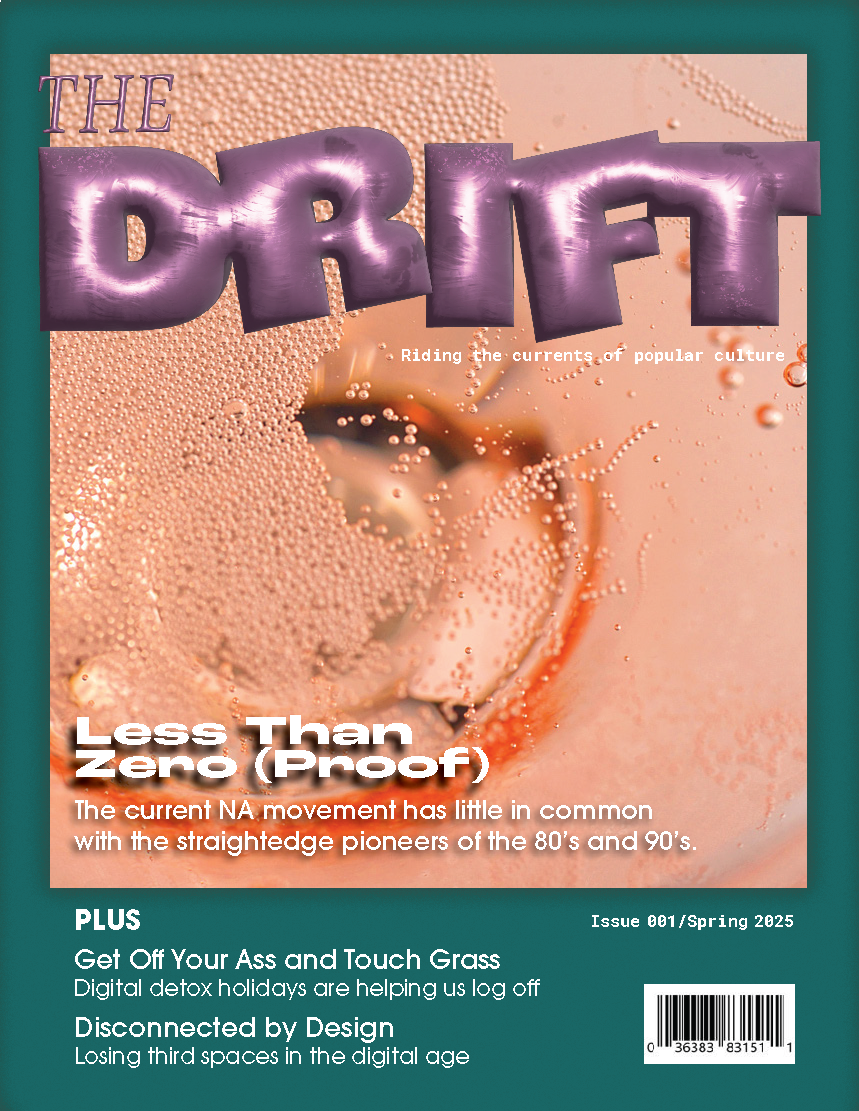
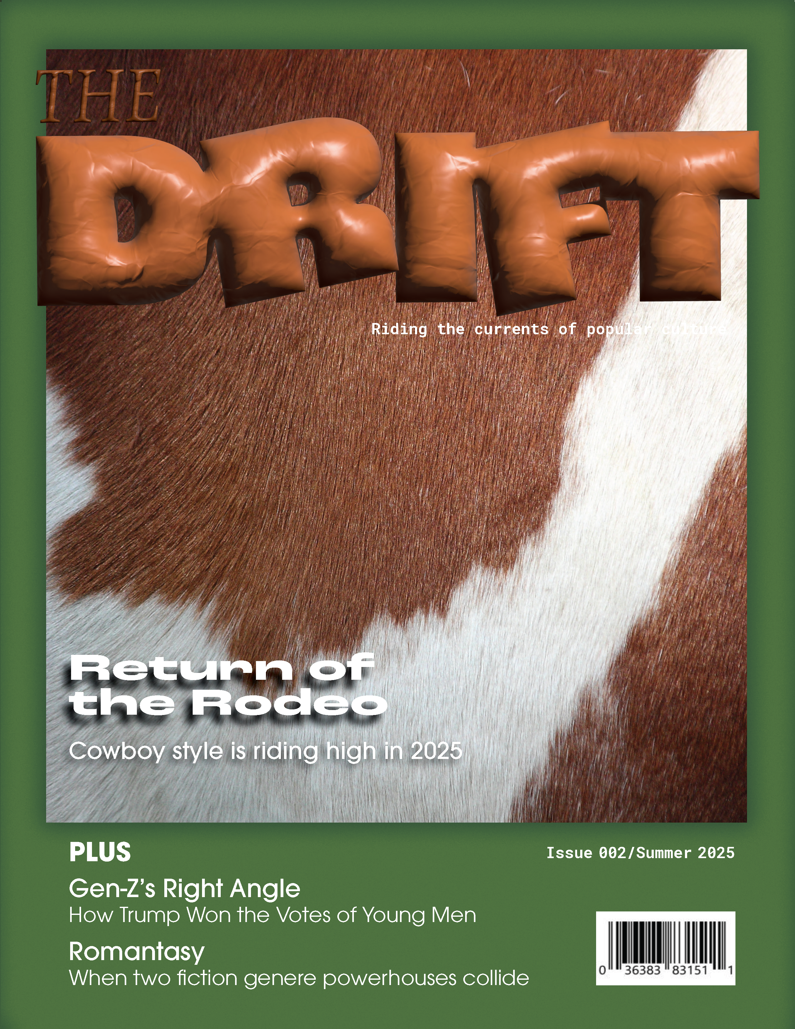
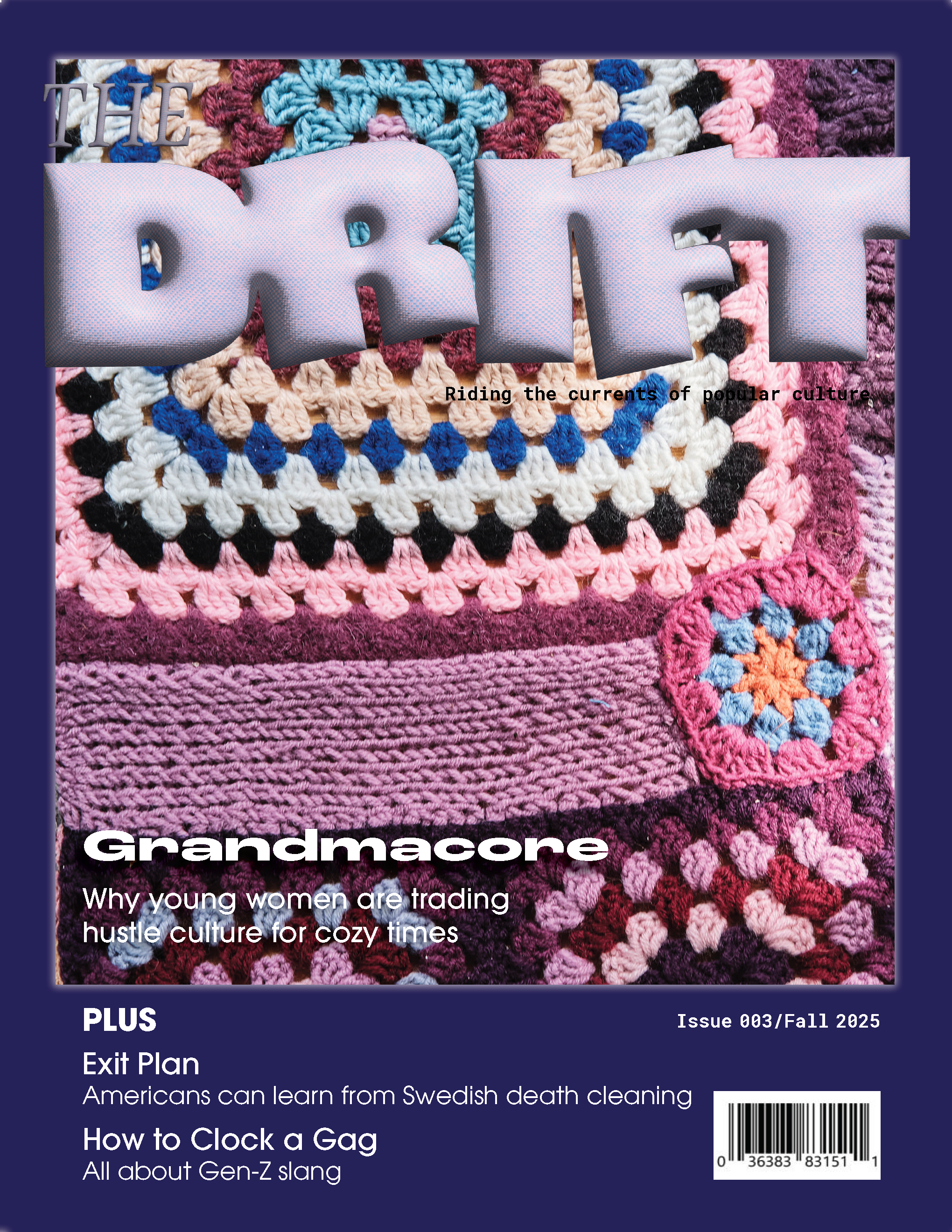
The logo is meant to look light and airy, like a balloon, to imply the flighty nature of trends. I wanted it to be adaptable to fit with the cover story for each article. The logo structure also needed a large landscape to illustrate the cover story's vibe.
The typefaces work together to provide hierarchy and readability.
The covers frame the main story, which features nearly macro-photography of a texture related to the story. The frame's color is pulled from the image, and other feature articles are listed in the color block below the image. The main feature's headline is positioned at the bottom of the image, allowing the reader's eye to pass over the image before finding the headline.
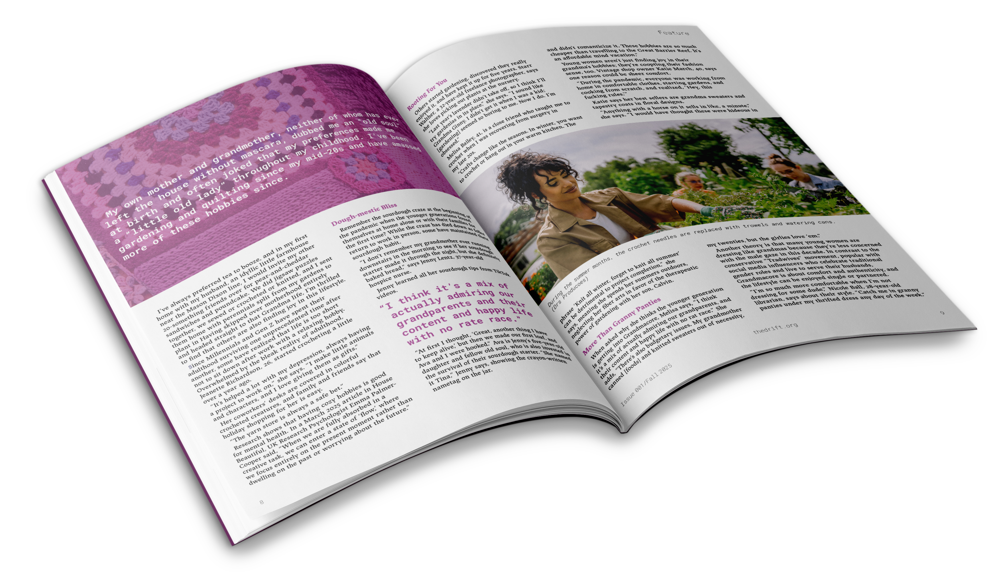
The opening magazine spread shows an oversized introductory paragraph set over a mirrored image of the cover. The preceding copy is layed into a two-column structure with large, full-bleed images spanning both columns. Pull quotes borrow color and font from the main image and color overlay, while staying restrained to one column.
Read the feature article "Grandmacore" to see an online version of the layout.