Take a classic, well-known novel and reimagine its design for a modern audience.


Take a classic, well-known novel and reimagine its design for a modern audience.
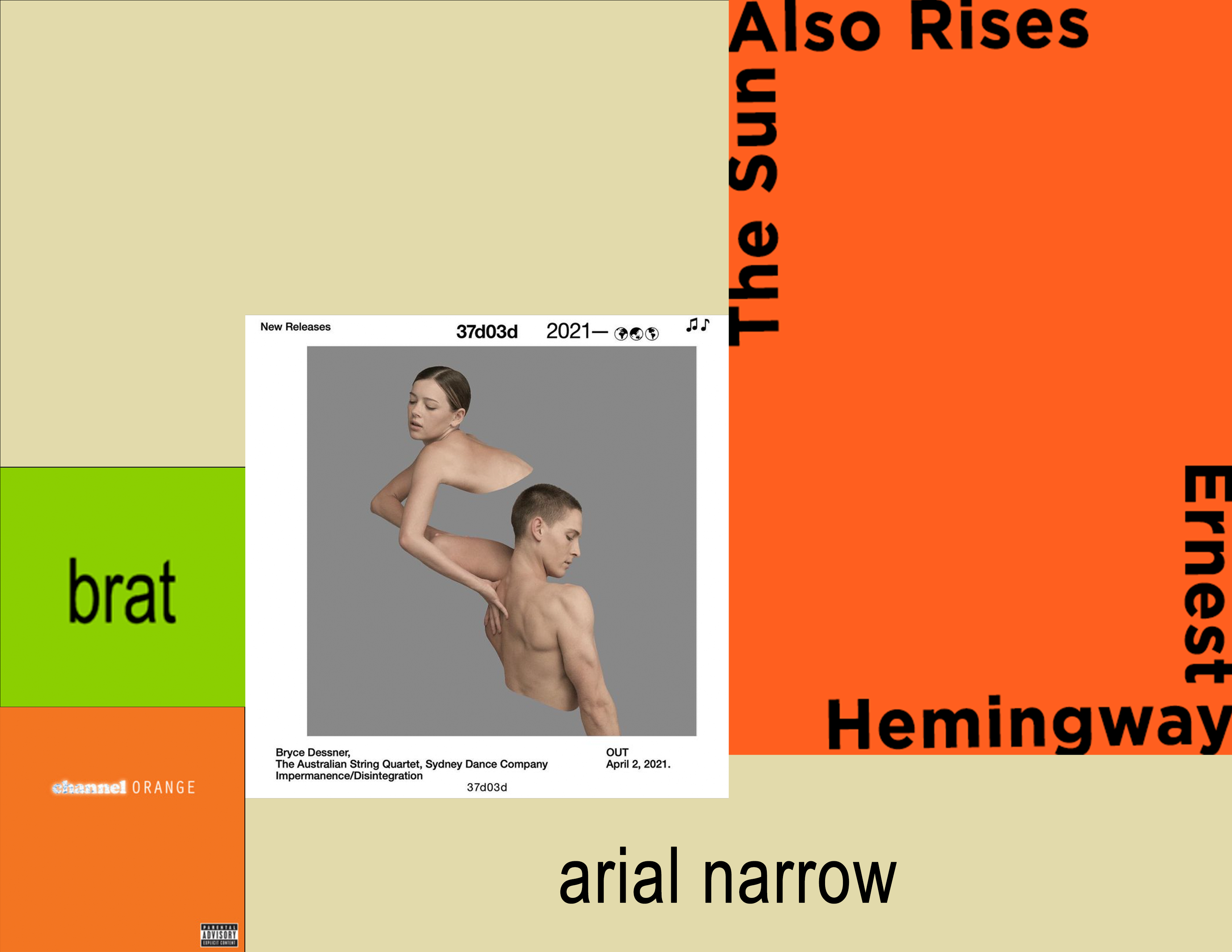
The mood boards started in very different directions, but I knew I wanted to use minimal imagery and a striking type treatment.
I ended up using elements from all three in my final design.
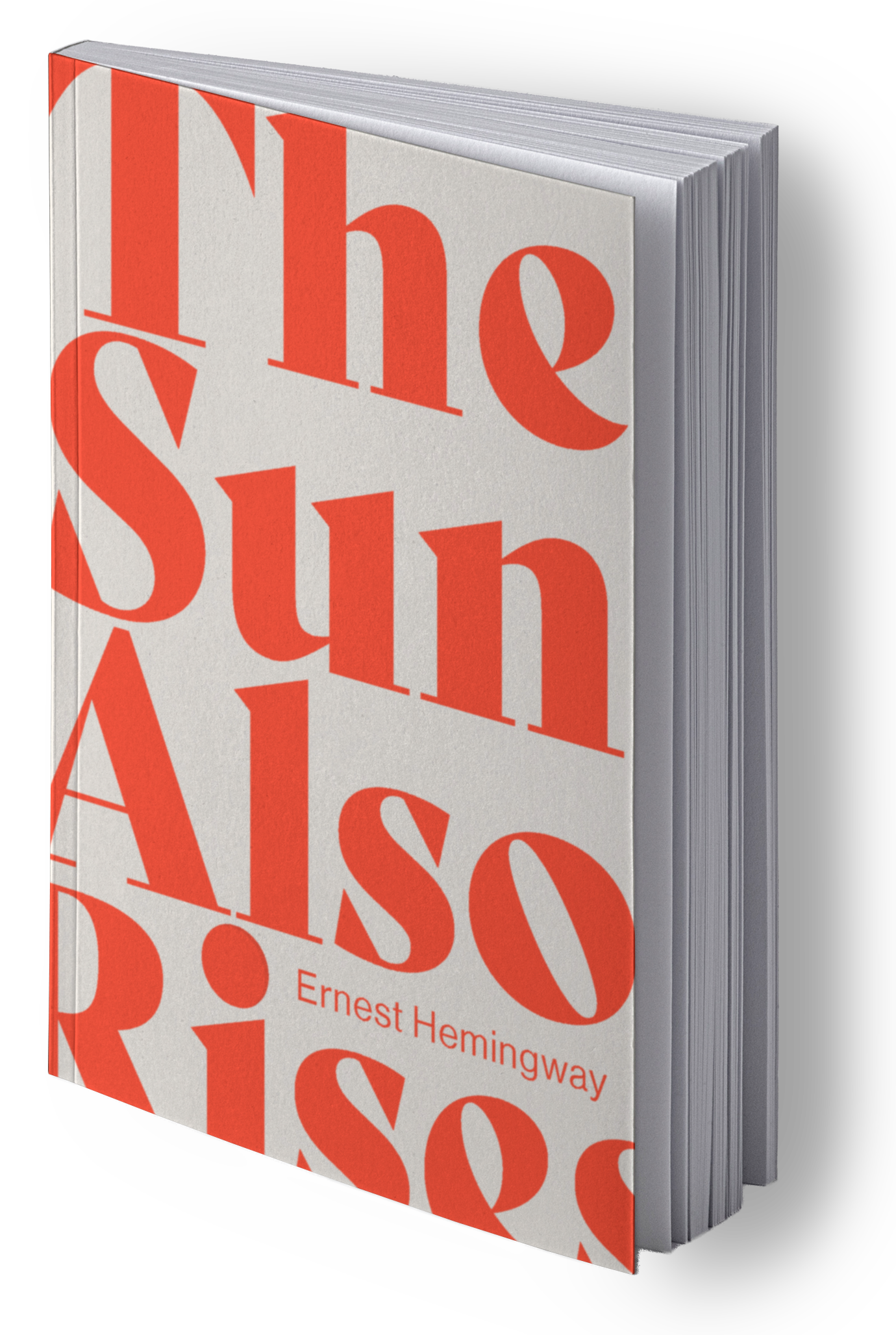
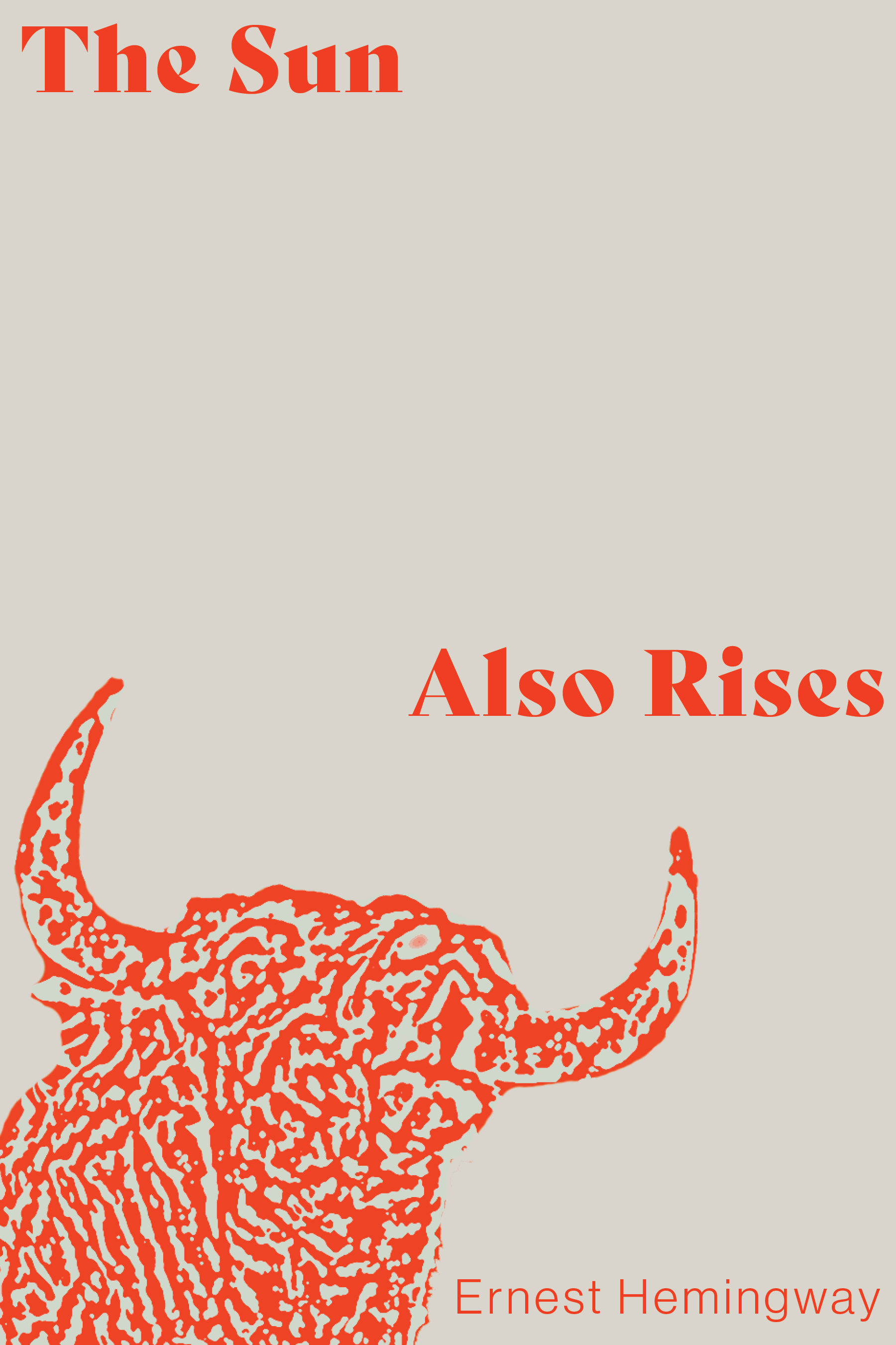
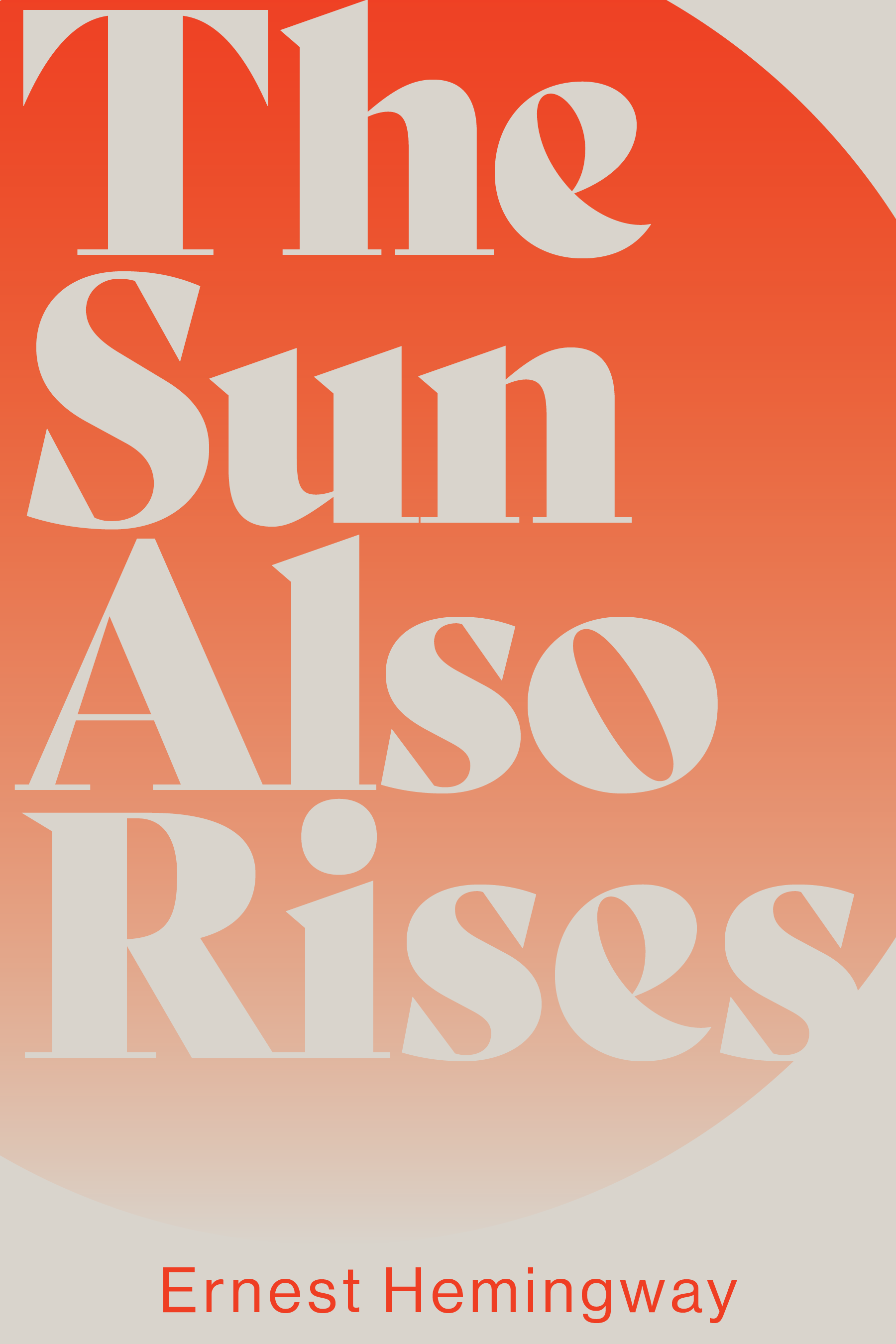
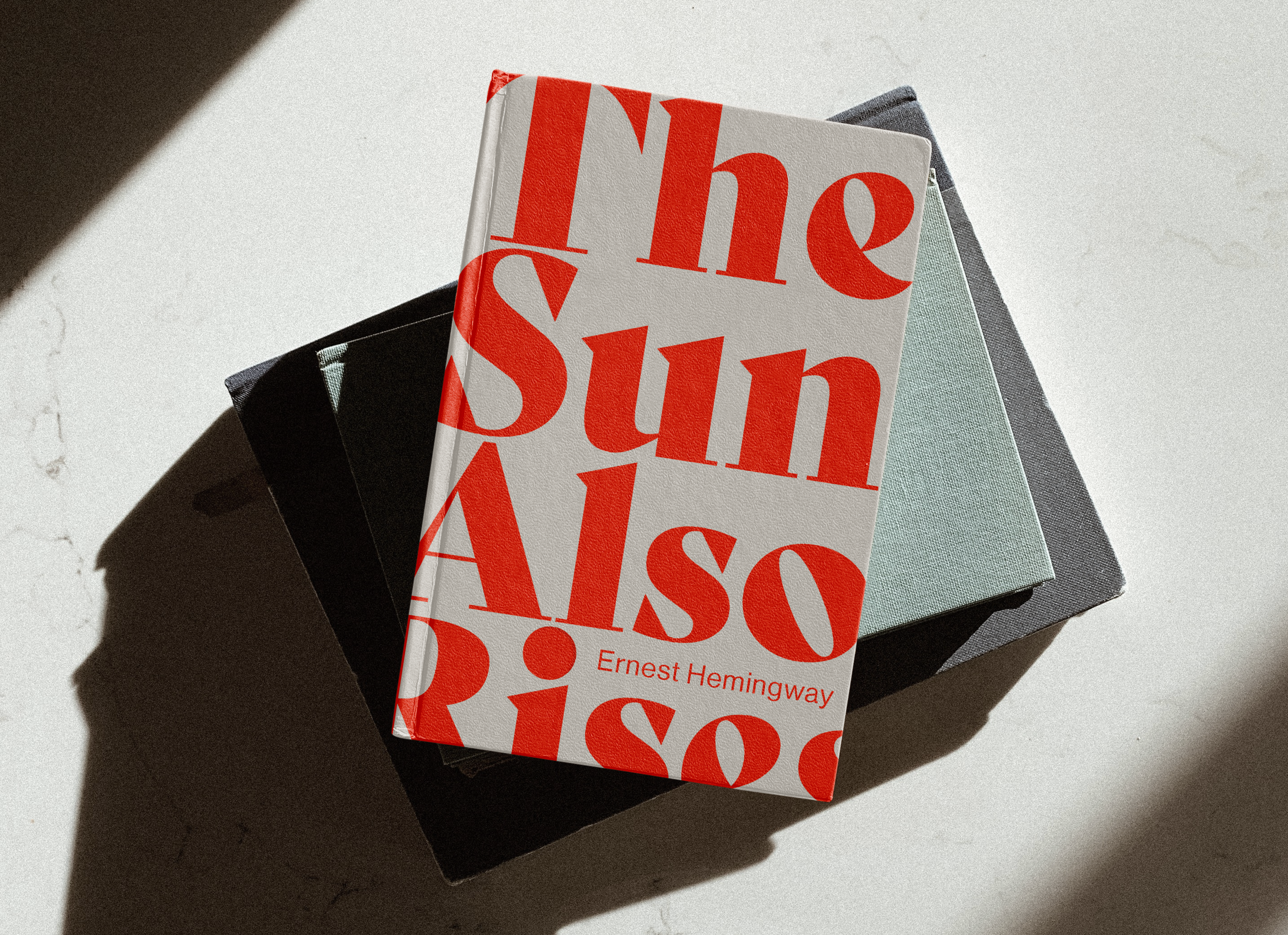
The orange-reds are reminiscent of both the rising sun and a matador's cape. It also alludes to the pivotal moment in the novel when Jake, the narrator, "sees red" and tries to fight Robert Cohen.
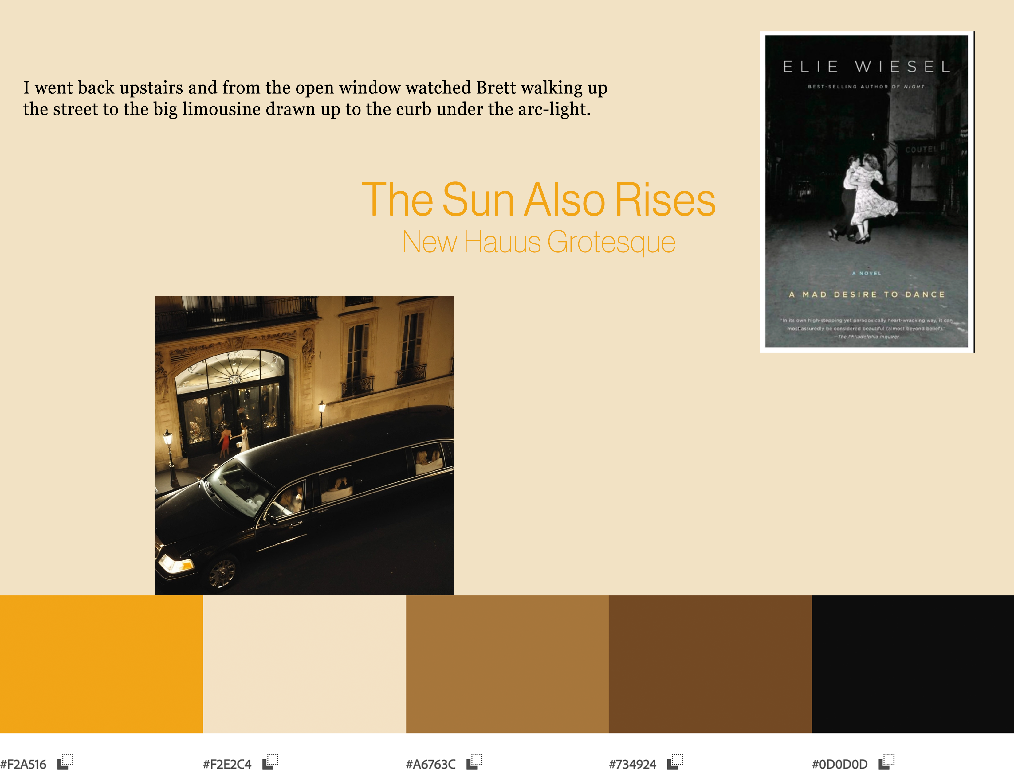
Bely Display, the slab-serif on the cover, invokes the decadence of 1920's Europe with a masculine bent.
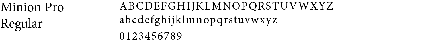
Minion Pro, a highly readable serif typeface, is used for the text.
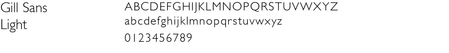
The byline is set in Gill Sans light, keeping Hemingway's name on the cover but out of the way.
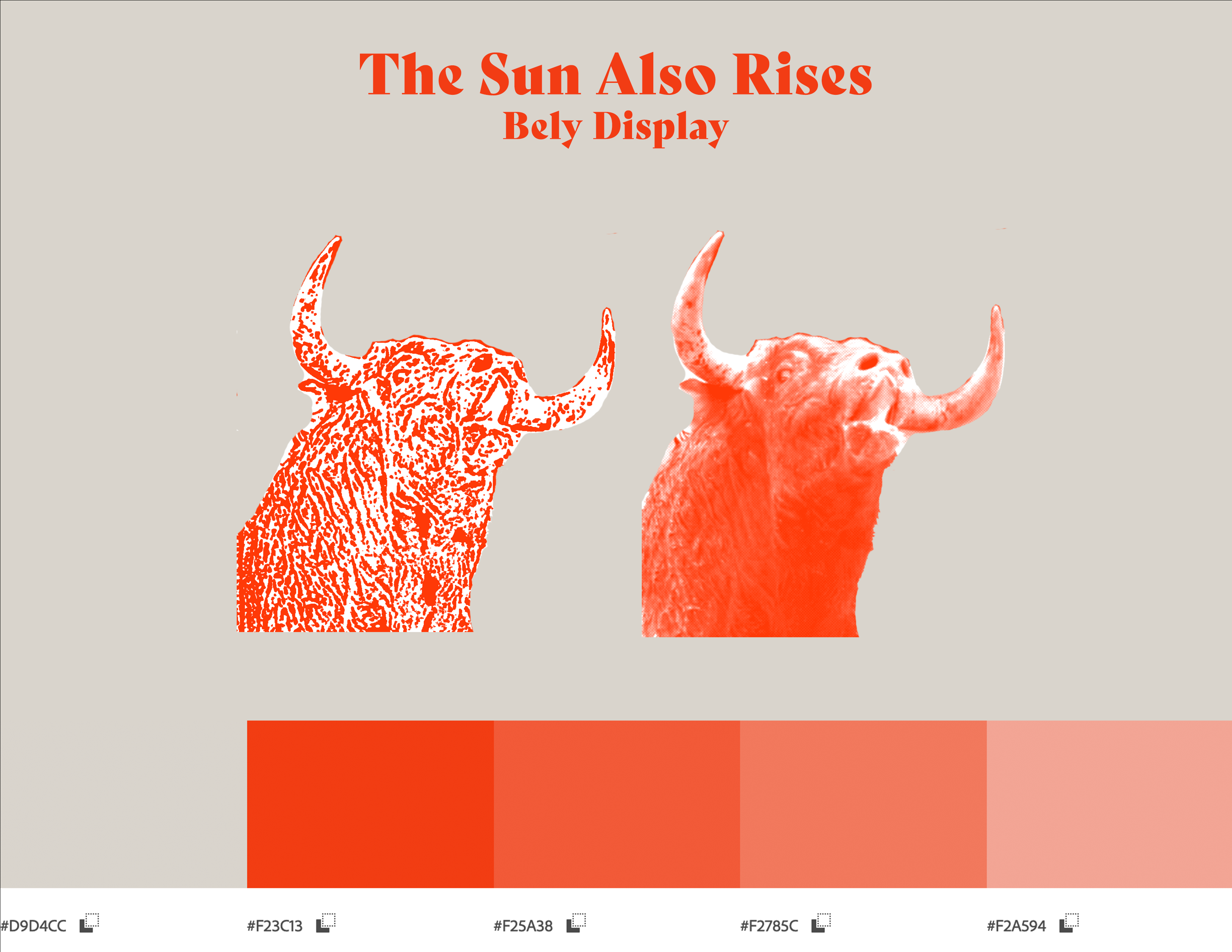
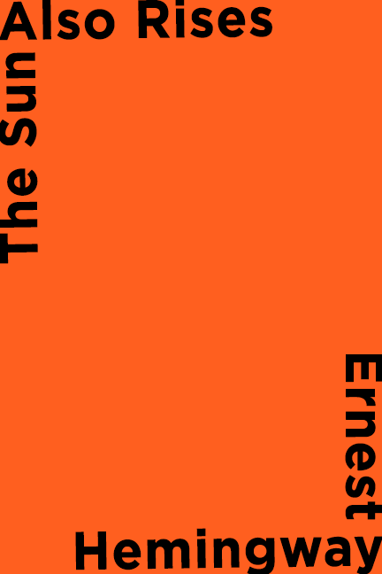
The three cover options use the same color palette, but the first uses a type treatment that didn't add anything to the design. For the second, I couldn't find a way to make a very expressive image of a bull in the midst of a fight legible. With the third, it felt too much like a setting rather than a rising sun.
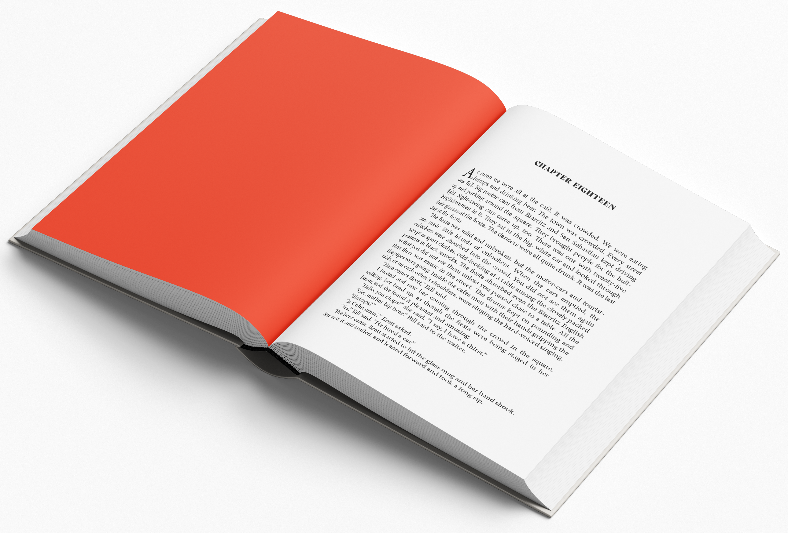
Each chapter is truly a break in action, and the story rising in momentum again. The full-bleed orange page conjures an early morning sun.